Prerelease:Undertale/Concept Art/Ruins
This is a sub-page of Prerelease:Undertale/Concept Art.
Contents
Areas
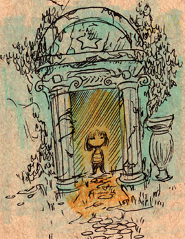
Sketch of Frisk in the doorway of the Ruins. Judging by the artstyle, this seems to have been drawn by Temmie.
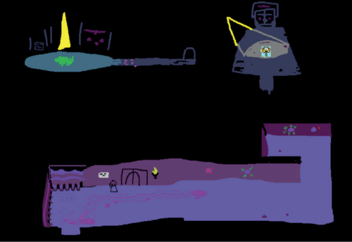
Concepts by Toby for the first few rooms of the Ruins. Interestingly, the Flowey sprite in the corner seems to be more detailed, perhaps even 16-bit.
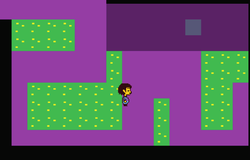
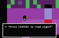
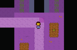
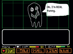
Various screengrabs of early versions of the Ruins, using various early tilesets.
According to Toby, the demo was finished with the tilesets used in all except the last of these screenshots. The EN stat in the first one was intended to be used for magic before it was cut, and the third screenshot showcases one of the first working rooms, which Toby was proud of.
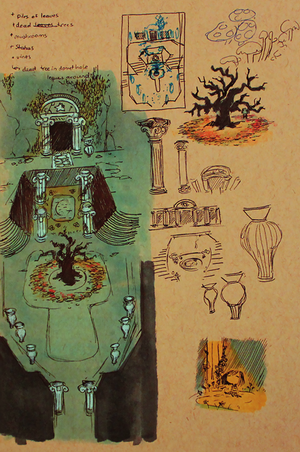
Various concepts for the first proper room of the Ruins, along with a cute doodle of Frisk. The barren tree was moved to just before Toriel's house in the final game.
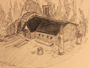
Temmie's concept for Toriel's house. Nobody drew her house in-game, so Toby just used already existing tiles for it. The waterwheel was supposed to power her electricity, which is why water appears earlier in the area.
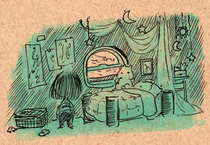
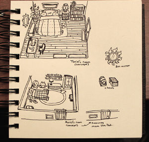
Concept for Asriel's former room by Temmie. The astronomy-themed decorations would be reused for Asriel's side of the bedroom in Deltarune.
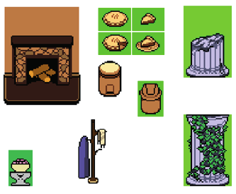
Various unused or alternate objects seen throughout the Ruins.
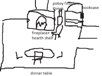
Very rough sketch by Toby of what he wanted Temmie to flesh out in Toriel's living room.
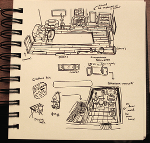
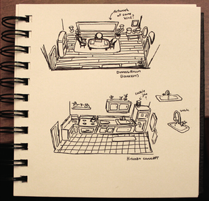
Drawings by Temmie of potential layouts of various rooms in Toriel's house. Of note is a separate room for the dining table, and a bathroom which, while not appearing in the final, would later be revisited for Deltarune.
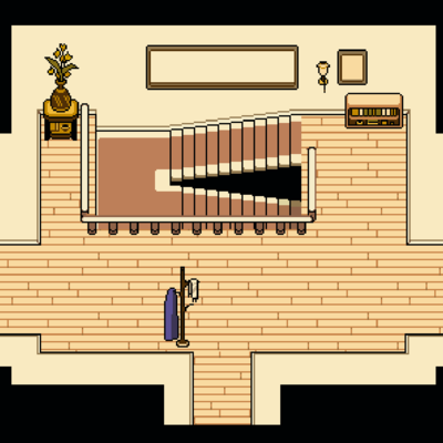
Toriel's entryway, with one key difference... There's a coat rack near the entrance, with a purple dress and a white scarf hanging off of it. This innocuous detail would be removed in the final game. Toby also explains that the large empty frame above the staircase was supposed to have a map of the Underground on it, but he forgot to add it. This is also why the hallway has similar empty frames.
Characters
Frisk
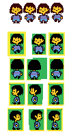
Frisk's original design, with black hair, slightly lighter stripes and no bobbing up when taking a step, compared with their final design on the top. According to Toby, their hair was changed so it wouldn't blend in with the many black backgrounds throughout the game. Toby also elaborates that Frisk's sprites are supposed to look somewhat lackluster to give the player a different expectation when starting it up blind.
Flowey
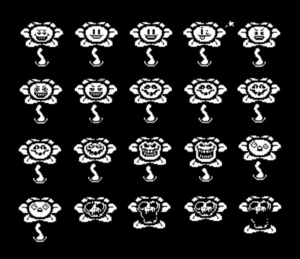
Various early Flowey faces by Toby. A couple are the same, some are only slightly different and most went outright unused. According to Toby, these were some of the first sprites he made for the game.
Toriel
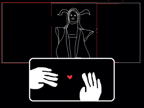
Very, VERY early (and creepy) rough design for Toriel in a mockup for the battle interface.
Very early concept sprites of Toriel by Toby. Most interesting are the various face designs on top, which includes a very crude preliminary design for her head that moreso resembles a crocodile rather than her final design. Along with this, there's many early faces without horns (two of which were posted separately on Twitter in higher quality, and can be seen below), which were added as Toby realized she looked too similar to the Mimigas from Cave Story (a noted inspiration). Below all of that are early versions of her battle sprites, which include some which went completely unused, such as her holding a plate of food.
The death sprites are so early because, according to Toby, killing Toriel was originally mandatory. However, Toby felt like killing her was wrong, so he decided to make her sparable, which seemingly birthed the game's main selling point of murder or mercy.
Happy Toriel with no horns.
Sad Toriel with no horns.
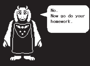
Humorous Toriel dialogue posted by Toby before the original demo released.
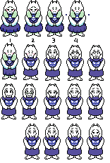
Very early designs for Toriel in the overworld, all designed by Temmie, along with a couple unused sprites for her final design.
Various other early Toriel overworld sprites, along with a very tiny Chairiel.
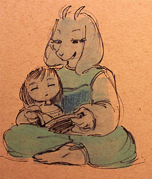
Early concept art by Temmie of Toriel and Frisk.
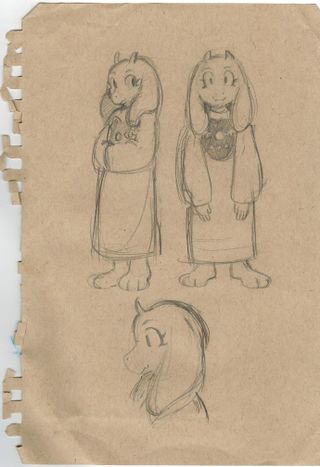
Sketches of Toriel, drawn by Temmie around the time the demo released. According to Toby, Temmie gave this to him the first time they met.
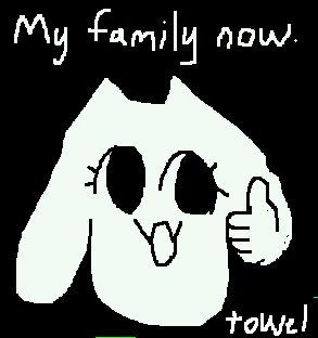
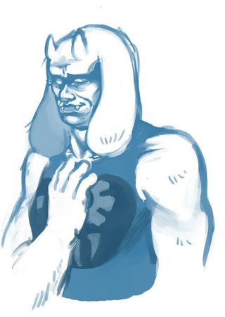
More "concept art" for Toriel, supposedly intended for one of the borders in the console versions. It was not added due to it being "evil and cannot be used".
According to Toby, this is "concept art" for Toriel. In actuality, this was merely a joke drawing made for the Kickstarter. This did actually end up being used in an edited state in the "Beauty" border in the console releases, however.
Napstablook
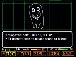
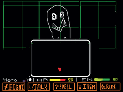
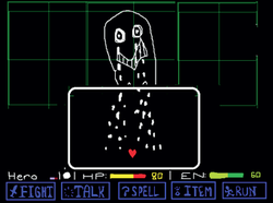
Apparently, Napstablook was just a placeholder character Toby made for his battle mockups, featured here. Playtesters loved them so much that Toby decided to make them an actual character. Along with this, Toby also explains that their battle theme was not made for Undertale, but was used as a reference to Pepper Steak from one of Toby's inspirations, OFF. These mockups also show the unused Energy stat in battle, and with the spell button also shown here, it suggests you were supposed to build up Energy for using spells on enemies. Undertale's sister game, Deltarune, would go on to utilize a similar mechanic in the form of Tension Points (TP).
Vegetoid
Vegetoid started out as a pumpkin named Pumpunk (and later renamed Squashy), but was changed at some point in development. The Squashy overworld sprite can actually be seen in the GAMETEST_7 demo played on Fangamer's Twitch channel.
Whimsun
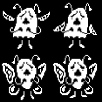
Whimsun's battle sprites, along with an unused variant with butterfly wings. This unused version was meant to be a harder variant of the enemy, but was removed as Toby didn't think the end result looked good.
Migosp
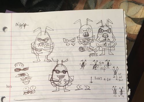
The first concept art for Migosp, who originally had different moves for the "spared" bullet, and more arms.
Migospel
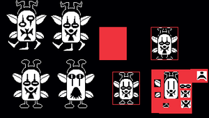
Early sprites of Hard Mode enemy, Migospel, including a variant with three legs. Toby had to downsize it, Moldessa and Parsnik later on as he made them too big originally.
Moldessa
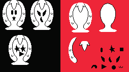
Early Moldessa sprites, along with some shape ideas for its face.
Multiple Characters
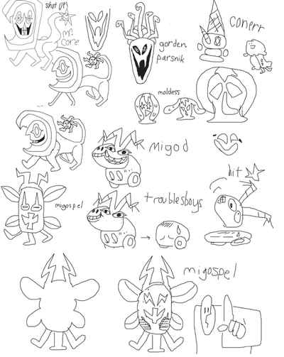
On this sheet, sketches of Migospel, Moldessa, and Parsnik can be found, all of them more or less identical to the final designs but with less detail. Migospel's do have very different faces though.
