Prerelease:The Sims (Windows)/Early 1999
This is a sub-page of Prerelease:The Sims (Windows).
Contents
January
Neighborhood Menu
| Jun '98 | Jan '99 |
|---|---|
 |
 |
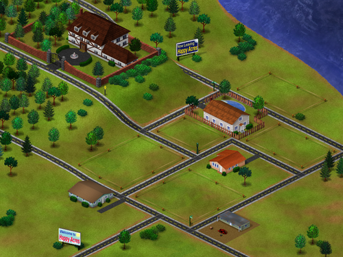
From this point onwards, the neighborhood screen underwent major changes that brought it closer to its final form, albeit in a vastly simpler version with core elements represented as placeholder shapes and flat colors. Though it may appear like a downgrade compared to the "Happy Acres" iteration due to its apparent emptiness, it introduces key special effects that mark it superior to the 1998 design.
- Houses' thumbnails now seem to dynamically update, reflecting user-made changes from the neighborhood perspective, unlike the previous demos where houses would be displayed as static images.
- Hovering the mouse cursor over houses displays detailed lot information instead of scenario-related images, hinting at the emerging sandbox focus and overshadowing the scenario-driven gameplay of earlier builds.
Buy Mode
| Jun '98 | Jan '99 | |
|---|---|---|
 |
 |

|
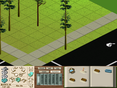
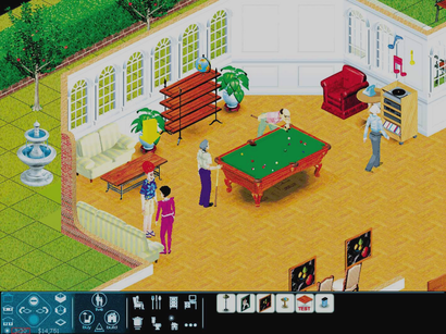
Media from this development era show that the previously-covered Build Mode GUI upgrades were also true for the Buy Mode.
| Jan '99 | Final |
|---|---|
 |

|
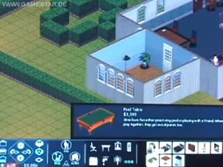
Oddly, the bed objects were originally assigned to the "Miscellaneous" Buy Mode category. It appears that both the names and descriptions of the game's objects at this time in development were simpler and more direct, and it still did not mention the motives the objects would increase/decrease. For example, the pool table object was simply called "Pool Table," and its text apparently describes the object by its function rather than using humorous sentences with marketing language, as seen in the final version.
Build Mode - Wall
| Dec '98 | Jan '99 |
|---|---|
 |

|
Columns have been added to the list of goods you can buy on Wall Mode.
Relationship Panel
| Jun '98 | Jan '99 |
|---|---|
 |
 |
First known case where friendship and romance icons are placed next to a Sim's relationship thumbnail in order to inform players how the active character feels about them.
Head Arrow
| 1998 | Jan '99 |
|---|---|

|
This pre-release build marks a significant shift in the way the active Sim is indicated: It introduces the first known instance of a three-dimensional object above their models, replacing the previous flashing 2D dot. This early iteration takes the form of a constantly spinning arrow. Unlike later mesh versions, it lacks sensitivity to Sim motives, meaning its color and behavior remain unchanged. Some of the final builds that contain development-oriented assets still have the arrow within its files as an old leftover.
Pie Menu
| Jun '98 | Jan '99 |
|---|---|
 |
 |
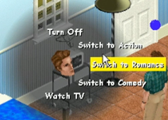
The pie menus in this version don't render the head of the active Sim. This would eventually return in later iterations.
Child Sims
This build also marks the first known inclusion of Child Sims in the game: in this case, a female Sim whose head mesh and texture seem to be similar to their final designs. Interestingly, though, "child-to-object" animations, equivalent to adult interactions for certain objects, were not yet implemented. This results in amusingly discrepant height shifts when child Sims attempt to use objects too tall for them, like kitchen counters.
Sim Thumbnails
| Jan '99 | Feb '99 | Mockup |
|---|---|---|
 |
 |

|
Being the latest character implementation in the build, child Sims feature a distinct character thumbnail generation rule. Their heads face the viewer directly, a departure from the previous slight-leftward-face thumbnail style. This frontal positioning would eventually become the standard for later character thumbnails, persisting through to the final build.
February
This development phase marks minor visual changes plus the first addition of a new body skin for the recurring scenario protagonist Ross, suggesting that here begins early experiments with multiple clothing choices for Sims.
Rubber Tree Plant
| Jan '99 | Feb '99 | |
|---|---|---|
 |
 |
|
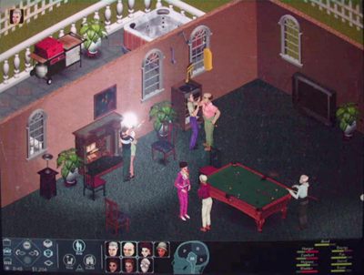
Now the rubber tree plant sprite is at its final horizontally mirrored version.
"Dance" Interaction
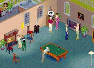
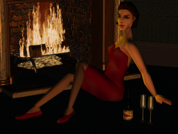
"Ross" and "Mercedes" dancing close to the fireplace. This is the earliest evidence of a dancing interaction among Sims.
Neighborhood Screen Artwork
 |
 |
 |
|
 |
 |
 |

|
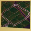
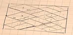
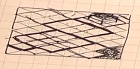
Following the implementation of the "Happy Acres" model for game's June 1998 build, developers explored and designed a brand new iteration of the neighborhood menu around this development period. At least two design prototypes emerged, even though they are not dramatically different from one another. The first featured a more extensive network of streets and seemingly could accommodate a greater number of savefile houses. Ultimately, the team settled on a design with a single road loop intersected by a meandering river, which flows out to a riverside vista at the edge of the screen.
March
| For those interested in further reading and a deeper exploration, here's a development-focused subarticle that delves into early Career Track texts documented and distributed for the community before the game's release, as they're directly linked to development builds from this period. |
New Logo
The first of two planned logo iterations for the franchise has been speculatively designed and implemented in-game during this development period. It was then prominently featured in promotional materials for E3 and the upcoming press kit CD.
Neighborhood Menu
| Jan '99 | Mar '99 |
|---|---|
 |
 |
Despite the short interval between builds, the neighborhood screen was given a dramatic upgrade, already resembling its final form. This iteration unequivocally laid the groundwork for the neighborhood screen's iconic layout.
- Red cubes morphed into the Sim Lane street loop.
- The simplistic, flat stream evolved into a more realistic and fitting counterpart, no longer cut-off by the lot thumbnails.
- Myriads of pine and apple trees have been added to basically all grassy areas that do not conflict with the lot thumbnail coordinates.
- Save thumbnails unveil a set of pre-made houses that are dramatically different from the final, with something that resembles a garage door at the upper-right mansion.
GUI
| Jan '99 | Mar '99 | |
|---|---|---|
 |
 |

|
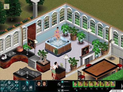
A household name in late '98 builds, the iconic skull-shaped control panel interface had been retired by the developers for good. In its place, icons replaced the typographic buttons, likely seeking clearer visual communication. The early Personality Panel icon notably is leftover in the final build.
Pie Menu
| Jun '98 | Jan '99 | Mar '99 |
|---|---|---|
 |
 |

|
Sim heads are now back in the center of the pie menu, just like in earlier iterations. Highlighting an item now showcases a rectangular silver fill behind it, featuring softened edges for a smooth look.
Sim Thumbnails
| Dec '98 | Mockup |
|---|---|
 |
 |
In this build, we see a shift in the thumbnail style for all the characters in the game. A feature previously exclusive to child Sims, now the adult Sims' thumbnails also are generated facing the viewer as literal captures of their head meshes, rather than pre-rendered images. Also, it is believed that characters no longer change their facial expressions to reflect their mood, getting closer to their final appearance.
Head Arrow
| Jan '99 | Mar '99 (A) | Mar '99 (B) |
|---|---|---|
 |
 |

|
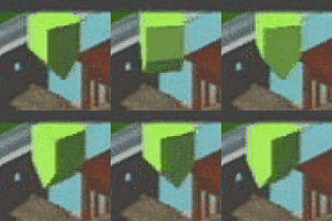
The "head arrow" model (not known as the "plumb-bob"... yet!) has its polygons modified, resembling a flipped house of sorts. It is the first instance where it changes its color, from green to red, to indicate the highlighted Sim's health. What's interesting is that the prop had a specific trembling animation signaling the Sims' poor mood.
New Sim Features
Because, at this point in development, the character model/texture aesthetics have already been very well established and matured by the developers, this development era marks the first addition of new adult characters since the Steering Committee trio, nearly 12 months prior. This is also the very first evidence of the creation of Light/Medium/Dark textures for a common head/body set.
Interactions
A first look at the "Entertain" and "Compliment" interaction, which survived the following development iterations the way it originally was. What's even more interesting is that the first snapshot shows a female Sim skin texture that did not make it to the final game.
Skins
- The "Biker", "Hipster" and "Mom" set of Sim skins/heads debuted on this build, as well as the "RnB01" Dark-skin exclusive texture.
- In fact, the "Biker" head textures didn't see major changes if one does not count his bandana's color change from blue to red.
"Bachelor Pad" Scenario A
This development phase marks the first known presence of a "bachelor pad" type of game scenario, starring a single, presumably sloppy Sim named Michael Ryan. Interestingly, he shares the same head texture as Ross, one of the three protagonists of the Steering Committee proto. This particular scenario would end up being consistently featured in pre-release builds across multiple iterations after this one, with layout differences between one save and another — it even appears on the game's official manual, as we'll cover later. Evidence suggests that developers utilized this save file to showcase the game to reviewers and media, and was more or less purposed to narrate the journey of a Sim attempting to a find sense for his life.
"Bachelor Pad" Scenario B
This lot likely represents the final moments of the pre-scripted scenarios from builds around this era. Here, the previously mentioned "bachelor pad" protagonist lives in a way fancier house with his new wife and baby (marking the earliest known presence of the baby cradle in the game), living life at its best.
Render
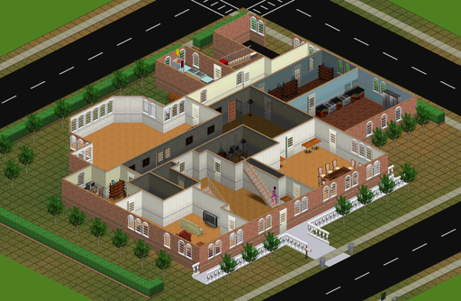
Full-sized mock-up renders that emulate the in-game environment up to par with the development from that time, for promotional purposes.
April
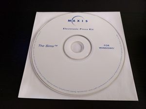
Press Kit Disc (April 14, 1999)
Boasting a much more cohesive set of objects, skins, and programming, the game was now solidified enough to warrant the "The Sims" moniker. About a month later, Maxis compiled a press kit CD for distribution to gaming magazines and other media outlets. This served, at worst, as a basic introduction to the game's premise, offering audiences a sneak peek through pre-rendered images, mocked-up gameplay snapshots, and Will Wright interview snippets. These were interestingly widely circulated across gaming websites at the time, to the point that, even today, many sources utilize them when covering the original The Sims game. Naturally, though, these early glimpses deviate significantly from the final product. Additionally, the press kit also features a black-and-white The Sims logo, different from the early 1999 red variation.


