Prerelease:The Sims (Windows)/Early 1998
This is a sub-page of Prerelease:The Sims (Windows).
Contents
Objects List
Objects that were implemented and prominently used during the development phases that this subpage covers, but were removed from the game afterwards. All of their known data were ripped off of the object resources from later prototypes, where they already manifested themselves as old, unused leftovers.
Contain Sprites
| Various | |||
|---|---|---|---|
| ID | Sprite | Note | Context |
| 128 | 
|
This stone pillar's draw group resources were extensively used in late 1998 prototypes as placeholder graphics for scriptless objects. However, it's speculated to have originally been a simple decorative object. | |
| Duck.spf | |||
Duck - The perfect pet. All you add is water and love. And duck food.
| |||
| 100-102 | 
|
A 2D virtual pet of sorts.
|
|
| 128 | 
|
This chair is a straight duplicate of the sprite resources from the "Duck" object, as an extremely early (and somewhat fruitless) experimentation with diagonal objects in the game, explaining the odd arrows. Otherwise, it's an ordinary black, heavy chair. | |
| fountain2.spf | |||
Fountain — Keeps you and your yard cool, calm and moist. It tinkles for you!
| |||
| 100 | 
|
Aside from the completely different appearance, this fountain differs from the one used in the final product because its base sits at ground level rather than being the same height as the Sims. Interestingly, the object was scrapped, but the animation files directly associated with it weren't. |  The animations associated with fountain2 can still be found in the retail releases of the game. (See Unused Animations) |
| puddle1.spf | |||
| 128 | 
|
A yellow puddle. Once upon a time, the developers considered making the bladder accidents a tad more realistic by painting it the color its real-life counterparts usually are, and this sprite must be one of their experiments with the concept. Fortunately, the accidents Sims in the final product have are light-blue, just like the plumbing disaster leaks. | |
| Terrain.iff | |||
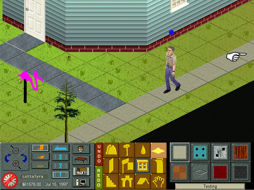
| 100 | In the final build of the game, the terrain system uses a set number of small, blade-like grass patterns scattered across the tiles. In earlier builds (up to mid-1998), it used an unsorted pattern of seven different sprites, including grass and flowers, that can not be interacted with. Players can see this by enabling the "enable sprite grass" button in the Steering Committee prototype's Terrain Tweak tool. |  The snapshot reflects actual gameplay in the Steering Committee prototype, while the control panel is a mock-up. | |
| 104 | |||
| 200 | |||
| 201 | |||
| 202 | |||
| 203 | |||
| 204 | |||
| tree1.spf | |||
| 100 | 
|
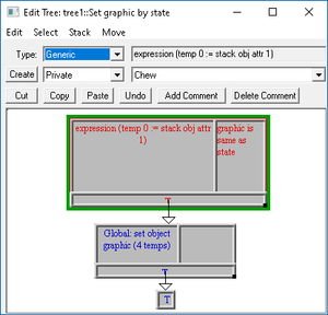
Early tree object whose sprites are akin to how trees look in late-1990s games of the Sim series. It's particularly special because it contains a scripting tree where its graphics were supposed to change to accommodate three seasons of the year, under the influence of its private constant Tree State (Summer/Fall/Winter). However, its sprite sheet only contains unique graphics for summer and fall. In the final product, there's no concept of seasons.
|
|
| 101 | 
| ||
Lost Graphics
| Various | ||
|---|---|---|
| Name/Description | Note | Context |
| Bed4.iff | ||
Single Bed - A fine place to sleep alone, whether by choice, modesty or necessity.
| ||
| CoffeeM.iff | ||
Espresso Machine - Add some zip to your life with hot steamy liquids!
| ||
| Exercise.iff | ||
Exercize Machine - Build your endurance, stamina and alertness with this hi-tech hunk of machinery.
|
Offers a nod to "Alertness," a feature originally planned as a Sim motive but later removed during development. | |
| floorlamp1.iff | ||
Light up your life... - and your house with this stylish-yet-affordable wrought-iron floor lamp.
| ||
| Flower.iff | ||
Lovely flowers add that homey touch to any home. Can't have a flower bed without them.
| ||
| Paint2.iff | ||
Tacky Painting - Buy this painting. If the artist dies, it might be worth something someday!
| ||
| Paint3.iff | ||
Strange Painting - Is it art? Who cares! It's in a frame and it covers those unsightly holes in the wall. What more do you need?
| ||
| Pinball.iff | ||
Pinball Machine - Ever since you were a young Sim, you've played the silver ball. Why stop now?
| ||
February
While not much information or media about this specific build exists, it offers a first glimpse at the game as it looked like immediately following EA's acquisition of Maxis. Just like the previous known build, it's a game based on scripted scenarios featuring a very limited amount of pre-made characters; most likely, players couldn't yet create families from scratch. Though still notably cartoonish compared to the final Sims, the characters here boast a higher polygon count than the Sim protagonists of 1997 builds, reflecting the team's attempt to keep pace with the contemporary graphical processing. The User Interface already displays elements familiar to players, including Sims' portrait thumbnails and the Control Panel's Mood Display, which even showcases motives like Stress and Alertness that only made it into the final version as unused remnants.
GUI
| 1997 (Mock-up) | Feb '98 (Mock-up) |
|---|---|
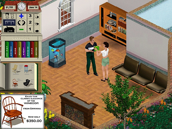 |
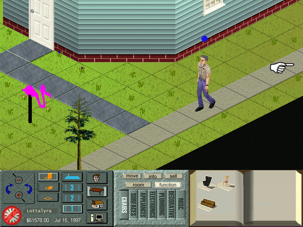 |
A definitive step in the graphical interface overhaul lies in the relocation of the control panel. It is no longer a vertical rectangular bar positioned on the leftmost side of the screen, reminiscent of a house-shaped structure as seen in older pre-release iterations. Instead, it has been transformed into a horizontal bar situated at the bottom of the screen, a placement choice that would persist throughout development and into the final release build. Furthermore, the previously monochrome UI icons dedicated to the game modes have now been infused with colors. Notably, the display of the current date has been expanded to include not only the day of the year plus month but also the year itself. The time of day, however, continues to be represented by a classic analog clock.
People Mode
This development phase of The Sims involved demo houses surrounding the life of only three unique Sims: Crazy Larry, The Duchess (sometimes internally named "Josephine Solo"), and The Colonel. The scenarios' storylines remain unknown. The characters' motive set in this build largely resemble that from the final release, with the exception of "Stress" and "Alertness," which were ultimately scrapped by the developers later that year.
Architecture Mode
In the Architecture Mode section of the GUI, icons far from polished.
Options Screen
The options screen offers support to two saving slots, and yet no evidence of a Neighborhood Screen.
Pie Menu
This builds marks the earliest evidenced instance where Sim interactions can be accessed via pie menus.
April
This phase bridges a small yet crucial gap between the previous iteration and those of late 1998, yet little is known about the build. However, its contribution lies mainly in expanding the (currently unknown) storyline with more characters, several of whom cemented the aesthetic that would serve as the primary reference point for the creation of future Sims.
GUI
| Feb '98 (Mock-up) | Apr '98 (Mock-up) |
|---|---|
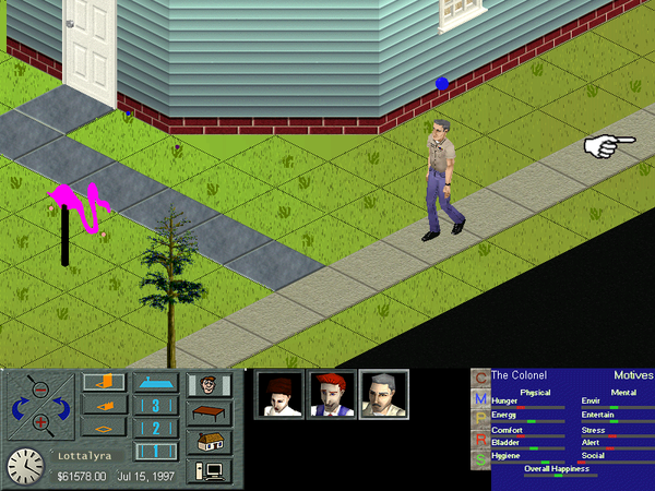 |
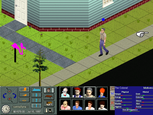 |
The characters' thumbnail template now renders them in lighting that is more approximate to the actual in-game rendering, and not as closely from the camera as before. The changes only apply to the newly added characters, as the engine still did not generate character thumbnails in real time.
Characters
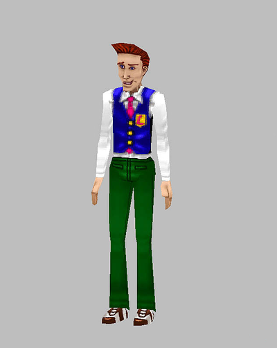
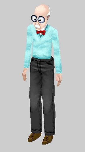
This development phase of The Sims involved demo houses surrounding the life of the following Sims, in order: Sigmund Silver, Gail Yail, Brad, Dunne Uh, Fritz Frisbee, The Colonel, The Duchess (sometimes internally named "Josephine Solo"), and Crazy Larry. The scenarios' storylines remain unknown.
- Even though Sigmund Silver does not appear in the final product as a playable character, it's interesting that there's a playful reference to him in the final build, as his character thumbnail is rendered in-game as a crash-proof substitute for the times the engine fails to create face thumbnails for the final Sims.
May
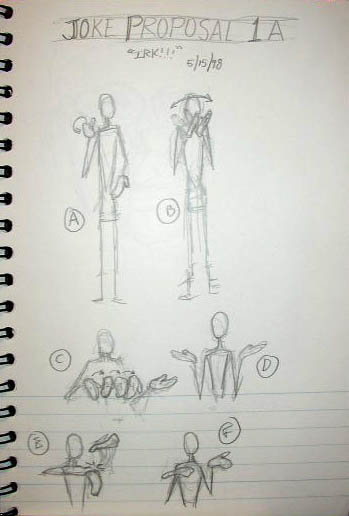
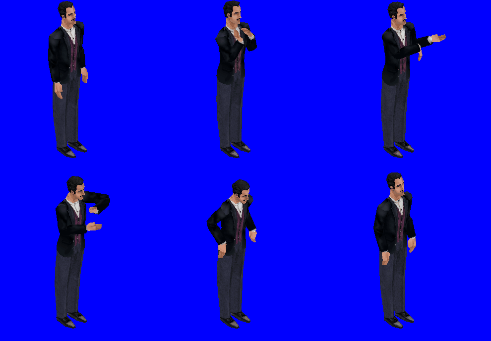
Irk's Animations
Eric "Irk" Hedman prominently works in the project as the Lead Animator. His body of handcrafted keyframes — bound to be brought to life via Don Hopkins' animation engine[1] — proved to be even more efficient within the tile-based environment of The Sims than subsequent, a-bit-uncanny motion-capture experiments[2]. Hedman masterfully transcended the limitations of the far-view, quasi-isometric environment, imbuing the characters with an expressive depth achieved through a robust pantomime-inspired set of animations (later enhanced by the addition of the Simlish language). Remarkably, his work persisted through development iterations with only minimal technical tweaking, a testament to its timeless charm.
| a2a-joker1-tell | ||
|---|---|---|
| Keyframe | Animation | |
|
| |

