If you appreciate the work done within the wiki, please consider supporting The Cutting Room Floor on Patreon. Thanks for all your support!
Prerelease:Super Mario Bros.
This page details pre-release information and/or media for Super Mario Bros..
| To do: |
Contents
Development Timeline
- 1984
- Fall - Development started at the same time as The Legend of Zelda, after Devil World and Excitebike were finished.[1]
- December - Miyamoto requests programmers at SRD to form an experiment with a controllable rectangle.[2]
- 1985
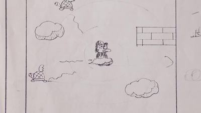
- Unknown Date - Specifications for Mario riding around in a cloud and rocket are drawn up.[3]
- February 5th - An early control scheme is designed.[2]
- February 20th - Specification describing the mechanics of how becoming big would work is written.[2]
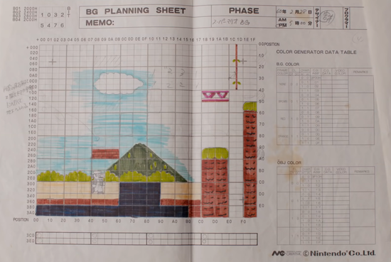
- February 28th - Planning sheet is drawn up containing Donkey Kong and Donkey Kong Jr. assets such as a red girder and a vine.[4]
- March 8th - Another planning sheet is created, possibly made for level planning.[5]
- June 27th - A draft of an early green title screen is drawn up.[6]
- July 19th - World 1-1 is finished around this time.
- July - Although the initial release date was intended to be during summer break, development time was furthered by 3-4 weeks to finish the game.[7]
- August 12th - Game was likely finished around this time according to the SMAS partial source code leak.
- September 13th - Game released for the Famicom.
- October 18th - Game released for the Nintendo Entertainment System in the USA.
- 1986
- February 21st - Game released for the Famicom Disk System.
- 1987
- May 15th - Game released for the Nintendo Entertainment System in Europe.
Early Development
Initial Concepts
Originally, Super Mario Bros. started development as a prototype created by Miyamoto's desire to have a game where you can control large characters. a rectangle that measured 16 pixels wide and 32 pixels tall, which was a placeholder until the actual player character was designed.[1] At this early stage of development, the game consisted only of a dark single non-scrolling screen with a blank rectangle that could not jump. Later on, the screen became side-scrolling and eventually gained its bright blue background.[2] At this point the game had still been using the blank rectangle template as the character.
However, when Takashi Tezuka noticed how well Mario Bros. was performing in arcades, Tezuka pitched to project head Shigeru Miyamoto the idea of using Mario as the main character. Miyamoto agreed and Mario became the leading character.[1] When Koji Kondo began composing the soundtrack, he first wrote the Underwater theme as it was the easiest to imagine. He was amazed by the early prototype's colors. The prototype consisted of Mario moving about with in front of a blue background and greenery. This rich scenery led to him creating an early theme which he describes as being lazier, laid-back, slow, and carefree. After later playing the game again, he realized this did not match Mario's movement and jumping. Designing a new theme with this in mind eventually led to the iconic theme we all know and love today.[8][9]
Title
At one point, the title Mario's Adventure seems to have been considered for the game in place of Super Mario Bros., at least for the U.S. version. The evidence supporting this is an early sales brochure for the arcade VS. System version, which uses the title VS. Mario's Adventure instead of VS. Super Mario Bros. This version of the brochure features original artwork on the front side, with a description of the game and screenshots on the back. The screenshots appear to be from the original console version rather than VS. Super Mario Bros. as evident by the font not having a drop shadow and the alternate World 4-2 warp zone, which contain the two pipes leading to Worlds 7 and 8 (VS. removed them and only has the World 6 pipe). A later version of the sales brochure uses the finalized title of the game, with the packaging artwork used for the Famicom version on the front in place of the original art (which seems to suggest that the earlier flyer was made before the game was even released in Japan) and the tagline edited to reflect the title change. The backside of the revised brochure is pretty much identical, except every instance of Mario's Adventure has been replaced with Super Mario Bros.
This theory is further supported by the fact that the title Mario's Adventure is registered in the U.S. Copyrights Office with the same register number used for Super Mario Bros. (PA0000273028).
Control Scheme
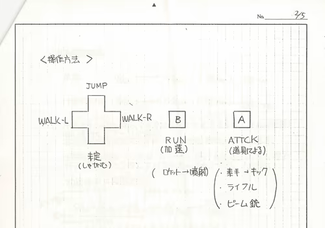
The game originally focused far more on shooting enemies than platforming tasks. The original control scheme was very different from the one we're familiar with; Up on the D-Pad was used to jump, while A either used an item (a rifle or a "beam gun") if Mario was carrying one or caused him to kick if he wasn't.[2] Here, a draft was drawn up to show this concept. Notice the square controller buttons as well!
Music
Koji Kondo originally composed the ending theme with an AABA structure, but since the song would take up too much memory, the "B" portion was cut. This version of the ending theme would later find use in VS. Super Mario Bros., and Super Mario Bros.: The Lost Levels features a slightly arranged version of the full song that also adds yet another section featuring a key change.[10]
Sprites
Mario
Concepts for Mario's skidding sprite, an arms crossed pose, and a propeller hat of unknown purpose, it is worth noting that 24 years later a powerup called the propeller shroom would be used in New Super Mario Bros. Wii.
This document includes sprite art of the arms crossed pose, and what look to be death sprites for Super Mario.[12]
The image above appears to depict sprite art of the cloud Mario would have ridden during the scrapped sky flying segments. The number "30", the NES's color value for white, is pointed at the cloud; it's likely that the sprite is only colored yellow so it can be visible on the paper it was drawn on.[12]
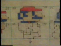
The top two pixels of Small Mario's hand were cut off in the final game so that the tile could be reused for other sprites.[13]
Early versions of Small Mario's jumping sprite and idle sprite. In the final game, these sprites were altered to be simpler in design, so that the tiles can be reused for other sprites, allowing there to be more space for other graphics. [13]
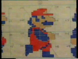
This running sprite of Super Mario lacks the hat symbol and uses the same eye as the final big Mario jumping sprite.[13]
A document with some early idle sprites, and walking sprites for Small Mario. The single visible frame of Small Mario's walk cycle shows an almost completely different design, as opposed to reverting back to being much closer to the design from his Donkey Kong walk cycle. The idle sprites seen here would eventually be used on the instruction screen of the PlayChoice-10 version of Super Mario Bros.[5]
Very Early Mario Walking Animation
| Scan | Mockup |
|---|---|
 |
The earlier walking animation sprites for Mario seem to use the same body parts as the ones that are used in Famicom Basic.
Unused Power-up
| Scan | Mockup |
|---|---|
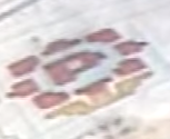 |
An early design of an unknown power-up, possibly of the Fire Flower.
Other
Some more planning sheets showcase early designs and sprites.
- The early tree-like platform appears thinner, much more similar in size to the mushroom platforms present in the final.
- The early design of Princess Peach (Toadstool) looks different. Notably, having white sleeves, a pink dress, and no visible lips. The second sketch seems to be the basis for her sprite in Japan's Super Mario Bros. 2.
- The early design of what appears to be the Super Mushroom is missing it's spots and is more rounded. This design resembles the throwable/stackable mushrooms in the USA's Super Mario Bros. 2.
- The early Lava Bubble (Podoboo) has black eyes, which are missing in his final design. This seems to be a remnant of Fireballs from Donkey Kong also having eyes. Eyes were eventually reintroduced back into their design starting with Super Mario World.
- The early design of Toads (Mushroom Retainers) appears slightly different. Notably, his eyes are spaced further apart.
Enemies
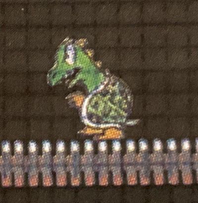
Dragon
| Scan | Mockup |
|---|---|
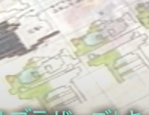 |
An unused design for a dragon-like enemy. It would've most likely come out of pipes akin to Piranha Plants.
"Cannon" Koopa
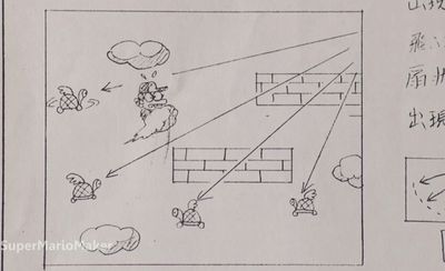
The drawing depicts a Koopa Troopa with a hat/helmet manning a cannon. The text next to the drawing reads, "Aims for Mario." The arrows next to the text shows the enemies attack pattern. It is likely that this is the early concept of the Hammer Bro., as the presence of a hat and the trajectory of their attack is similar.
Cannons would later appear in Super Mario Bros. 3 with a similar design without a Koopa Troopa manning it, and the cannonballs would instead travel in a straight line.
Naked Koopa
The drawing depicts a Koopa Troopa without its shell, wearing a tank top while holding what looks to be a pitchfork or rake. The text next to the drawing reads, "Pacing around naked." This appears to be an idea carried over from the previous Mario Bros.; if a Shellcreeper is flipped upside down and left alone, it hops out of its shell to flip it back over, revealing a white tank top.
This idea was dropped for Super Mario Bros., but it would reappear in later games, the first being Super Mario World.
Sidesteppers
A sprite sheet showing Sidesteppers from Mario Bros.. Sidesteppers would later appear in Super Mario Bros. Special, one of Super Mario Bros. direct follow up games.
Early King Koopa Design
An early King Koopa, with a sprite of his arms on his side.
Earlier King Koopa Design
An earlier design of King Koopa can be found in the Super Mario Maker booklet.
Title Screens
Title Screen (1)
| Draft Design | Final |
|---|---|
 |
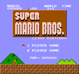 |
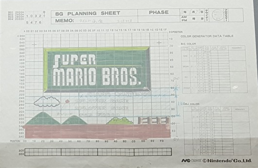
The Title Screen had major differences at one point during development.
- The logo was green at one point.
- The logo was slightly larger.
- The "S" in "Super" was different.
- The option cursor was a brick as opposed to being a mushroom.
- The background details are different, though this is more likely a result of the background generation routine used in the final game than a deliberate change.
- The UI on the top of the screen is missing, although it's unknown if this is intentionally left out or not.
Title Screen (2)
| Draft Design | Final |
|---|---|
 |
 |
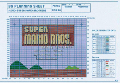
This concept art of the Title Screen is closer to how it looks in the final game, but still has several differences. Carried over from the previous draft is:
- Two hills instead of one, like in the final. However, the hill on the left is now larger, matching the size of the one seen in the final game.
- The UI text being slightly different, spaces are placed in between text in a few instances.
- The UI on the top of the screen is still missing, although it's unknown if this is intentionally left out or not.
Besides carrying these elements over from the last Title Screen draft, this draft has differences from the final:
- The option cursor is completely missing. This was likely a mistake.
- The bush has been moved over to its final position, but is still smaller than it is in the final game.
- The "bolts" on the corners of the logo are black instead of being the same color as the text on the logo.
- The logo is placed a tile higher compared to the final game.
- The "©1985 NINTENDO" text is white instead of tan. Interestingly, its color in the final game seems to be a side effect of how the logo is colored.
- The copyright symbol has a different design.
Interestingly, the memo sheet for this title screen doesn't match the one used for the other drafts, and appears to be a recreation.
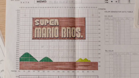
Title Screen (3)
| Draft Design | Final |
|---|---|
 |
 |
This concept art of the Title Screen is the closest to how it looks in the final game, but still has just a few differences.
- The option cursor is still a brick as opposed to being a mushroom (This time it's uncolored).
- There are still two hills instead of one, and the bush is still smaller compared to the final game.
- The "bolts" on the corners of the logo are still black like in the previous draft.
- The UI text has been mostly finalized, but still has a few spacing differences.
- The UI on the top of the screen is once again missing, although it's unknown if this is intentionally left out or not.
Level Objects and Items
Sky Levels and a Ridable Cloud
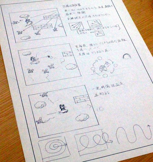
Ever since the beginning of the games development, Miyamoto imagined Mario flying in the sky. This would take advantage of Super Mario Bros.' original control scheme (seen here). The game originally had sky segments (in addition to the earth and sea segments which ended up being used). These sky levels consisted of Mario riding originally on a rocket. This was changed to then be Mario riding on a cloud. Mario would shoot at enemies (and coins[5]) amongst the clouds/sky with a rifle and a "beam gun". Though six months before completion, Miyamoto "divided the actions" between ground and sky. The sky-based bonus rounds accessible via vines in the final game are apparently a remnant of this idea.[2] The developers gave up on these concepts partly due to memory constraints.[14] This entire concept would later be introduced in Super Mario Land, via its Sky Pop/Marine Pop vehicles and its sky/underwater levels. Ridable clouds specifically would also later be implemented as Lakitu's Cloud in Super Mario Bros. 3 as an item on the map that you ride that would let you skip a level, but more notably ridable clouds would return in Super Mario World, where you could ride in Lakitu's Cloud in a level for a short period of time after defeating Lakitu.
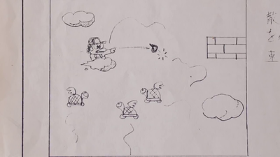
Here is a concept document that was drawn up, showcasing some of these ideas. The cloud Mario is riding eventually also got a concept sprite (which can be seen here). Mario is also able to throw fireballs in the cloud, as seen in the second drawing.
Some close-up shots of this document.
Level Designs
Unused Draft Level, Donkey Kong Girders and Donkey Kong Jr. Vines
Various elements from Donkey Kong, Donkey Kong Jr., and Mario Bros. were planned at one point with some objects/enemies making it into the final release.[15] A draft of these elements were drawn up. Besides some different looking graphics (most notably the ground tiles appearing behind Mario to create a certain isometric effect, and faces on the tree platform tiles) a red girder from Donkey Kong and a vine from Donkey Kong Jr. appear in this planning sheet. Vines were later added to the game but look and function differently.
This level seems to have been drawn-up when the game was still using its screen-by-screen level format.
World 1-1
| Draft Design | Final |
|---|---|
 |
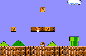 |
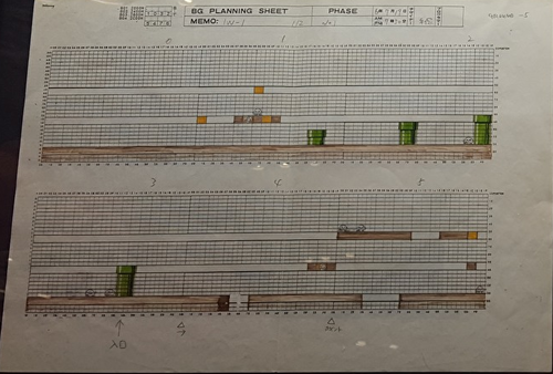
As seen in the first draft, the first difference would be the first Goomba is on top of the blocks above. It is also possible to see the 2nd hole in the level was originally closer to the block with the mushroom in it, also appearing to be slightly bigger. The 2 Goombas near the Star also appear to have been closer to the multicoin block. There were also some more Goombas in the level. In the 2nd draft, which is possibly later, the first Goomba was moved down along with less Goombas. Some of the Goombas had moved again with the most obvious difference being the Goombas near the 4 sets of stairs. The team had developed the levels out of order, with 1-1 being the final level they worked on. Goombas had been added late in development as it was thought Koopa Troopas would have been too difficult for a beginner. It is possible that the first Goomba was originally a Koopa Troopa.
World 1-2
| Draft Design | Final |
|---|---|
 |
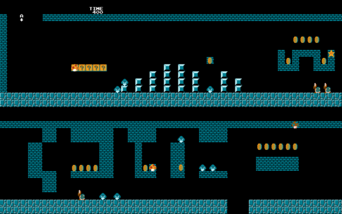 |
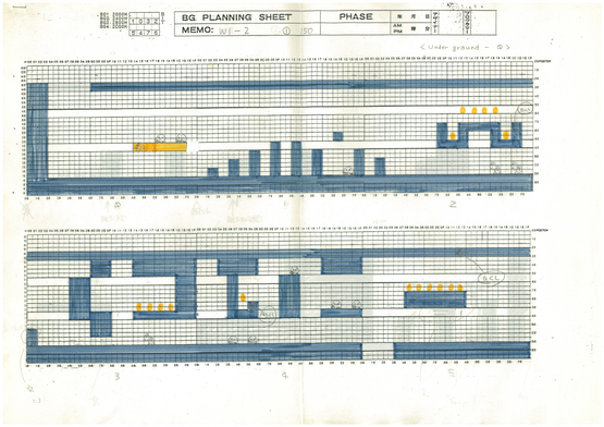
At the start of the level, It is good to note that the general level is pushed to the right more than the final, this is possible to see as the wall at the start originally was a few blocks thicker causing the level to be slightly shifted to the right. The first two Goombas were originally situated on top of the row of Question Mark Blocks. After the first two Koopa Troopas, there is a small wall made of two bricks behind the pair. The lone coin next to the hidden power-up block was originally one block higher up. The two Goombas after the third Koopa Troopa were placed further. The row of coins seen after the first pit and underneath the hidden 1-UP block was lower than in the final design.
| Draft Design | Final |
|---|---|
 |
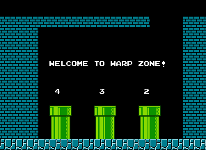 |
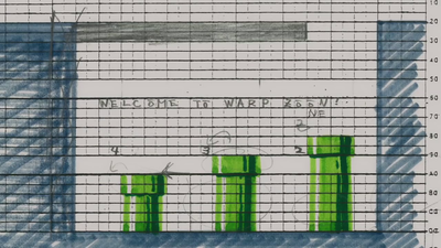
The Warp Zone pipes in the original level layout for 1-2 have the pipes arranged at different heights and moved over to the right slightly. This was presumably changed due to the pipe on the far right being too tall for Mario to jump over if he were to get stuck between the pipe and wall (possible case the jump heights were once higher, by one block at least). "WARP ZONE" was misspelled as "WARP ZŌŌN" but later corrected at an unknown time.
World 4-2
| Draft Design | Final |
|---|---|
 |
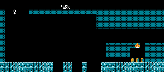 |
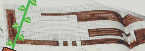
The beginning of World 4-2 was much easier in the early layout. The hole from which Mario falls from is much smaller. The gaps seen at the beginning were much smaller and farther to the left in the draft. The "tunnel" section was much longer. There were four coins in the original draft instead of the three coins seen in the final.
| Draft Design | Final |
|---|---|
 |
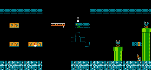 |
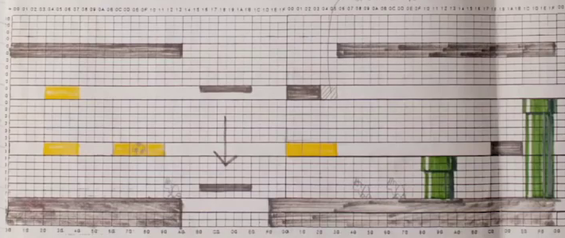
Multiple Koopa Troopas were removed from the final level, with the early design showing one before the moving platform and two after the platform. This gap was originally smaller by one block. The four hidden blocks leading to the Warp Zone vine were originally a row of three Question Mark Blocks. The brick block containing the vine was originally placed on the right side instead of on the left and had been planned to appear inside of a hidden block rather than a brick block. The Koopa Troopa seen stuck in between the pipes of the final game was not present in the early draft.
| Draft Design | Final |
|---|---|
 |
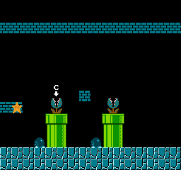 |
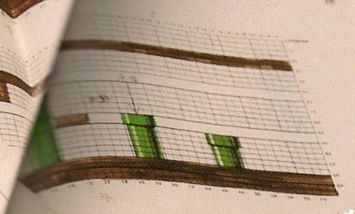
The draft design lacks any of the Buzzy Beetles or Piranha Plants in the final. The second-to-last pipe was originally one block taller and there is no multi-coin block seen beside it.
World 5-1
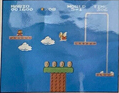
| Early Screenshot | Final |
|---|---|
 |
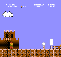 |
Originally, 5-1 was planned to be an athletic level with tall trees, whereas in the final game it's a ground level. Additionally, the timer in this level appears to start at 400 seconds rather than 300 as seen in the final game. This early level design is not seen anywhere else in the final game.
Also note the rope cutting through a cloud, an issue that the level designers had to carefully work around, as background patterns were automatically generated and could not be altered.
World 6-1
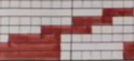
| Draft Design | Final |
|---|---|
 |
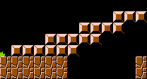 |
The only difference from the draft design is a single additional block that was added underneath the staircase at the start of the level.
Bonus Rooms
| Draft Design |
|---|
 |
| Final |
 |
The bonus rooms appear to have gone through many changes while being drafted as can be seen by the many scribbled and whited out parts. The bonus rooms were designed on July 15th and later revised at unknown date.[5]
- In the room on the left, the hook-like shape holding the coins was closer to the ground than in the final layout. The multi-coin block next to the pipe was lower as well.
- The middle room is the same as the final layout, though some extra coins appear to have been whited out, probably due to the game not being able to display more than three layout objects vertically.
- The room on the right has the top row of coins being a block higher and the bottom row has two fewer coins. The brick blocks were originally one block closer to the right, but the many red arrows instructed the level programmers to have the bricks adjusted to the left by one block.
Castle Exits
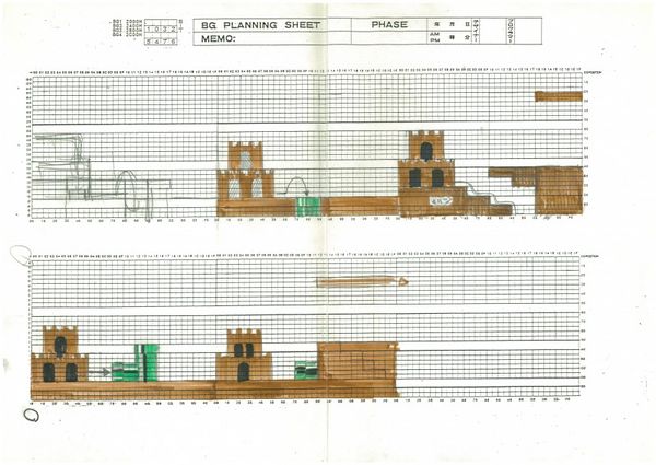
Some early "castle exit" areas.
References
- ↑ 1.0 1.1 1.2 Iwata Asks: New Super Mario Bros. Wii, Vol. 2, Page 4 - Nintendo, Nov. 13th, 2009
- ↑ 2.0 2.1 2.2 2.3 2.4 2.5 Iwata Asks: Super Mario 25th Anniversary, Vol. 5, Page 1 - Nintendo, Sept. 13th, 2010
- ↑ Iwata Asks: Super Mario 25th Anniversary, Vol. 5, Page 2 - Nintendo, Sept. 13th, 2010
- ↑ Iwata Asks: Super Mario 25th Anniversary, Vol. 5, Page 4 - Nintendo, Sept. 13th, 2010
- ↑ 5.0 5.1 5.2 5.3 Super Mario Bros. 30th Anniversary Special Interview ft. Shigeru Miyamoto & Takashi Tezuka - Youtube, Sept. 14th 2015
- ↑ Nintendo NY 2015 - Nintendo World Report, Feb. 22nd, 2016
- ↑ Super Mario Bros. 25th Anniversary - Interview with Shigeru Miyamoto #1 - Youtube, Dec. 7th, 2010
- ↑ Iwata Asks: Super Mario 25th Anniversary, Vol. 5, Page 5 - Nintendo, Sept. 13th, 2010
- ↑ Mario Maestro Interview - Internet Archive, Oct. 19th, 2007
- ↑ Koji Kondo – 2001 Composer Interview - game maestro vol. 3 / Shmuplations, 2001
- ↑ Supper Mario Broth - Supper Mario Broth, Nov 8th. 2014
- ↑ 12.0 12.1 Retrogaming / VHS tape archive one
- ↑ 13.0 13.1 13.2 13.3 13.4 13.5 13.6 13.7 13.8 Channel 4 1993 Creating Video Games - including adverts - Youtube, Sept. 7th, 2020
- ↑ Iwata Asks: Super Mario 25th Anniversary, Vol. 2, Page 6 - Nintendo, Sept. 13th, 2010
- ↑ Iwata Asks: Super Mario 25th Anniversary, Vol. 5, Page 3 - Nintendo, Sept. 13th, 2010

