If you appreciate the work done within the wiki, please consider supporting The Cutting Room Floor on Patreon. Thanks for all your support!
🎊 Happy 2025, TCRF! 🎊
🎊 Happy 2025, TCRF! 🎊
Development:Nintendo DSi
Jump to navigation
Jump to search
This page details development materials of Nintendo DSi.
| This page or section details content from the September 2020 Nintendo Leak. Check the September 2020 Nintendo Leak category for more pages also sourced from this material. |
Early Main Menu
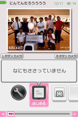
Present on Page 8 of platinum.7z/twl.7z/TwlIPL/tags/XXX/docs/ParentalControl_20080111_J.pdf ("XXX" being any branch between 20080213_SDK4134 and 20080312_hotsw) is a screenshot of an early System Menu. The date in the screenshot appears to be December 11, 2007, nearly a year before the DSi's release.
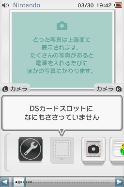
| Early | Final |
|---|---|

|

|
From top to bottom:
- The scanlines are much more visible, though only on the Top Screen.
- The battery indicator is on the top-left of the Top Screen. The final system has it on the top-right.
- There's no volume indicator.
- The nickname isn't color-coded to the selected system color.
- The date and time are green, which might have changed color when the battery level was low.
- The picture frame is smaller, which could also indicate that pictures were taken in a smaller resolution.
- The L and R button triggers have more text (translating to "Camera Button").
- The text bubble has scanlines. It's also slightly different in design.
- Only the first line about "no inserted DS carts" is present.
- There's no bracket to show the beginning or end of the application list.
- Some of the icons are different:
- System Settings is circular rather than square, as well as being horizontally flipped.
- The DS Card icon is identical to the one from the Nintendo DS BIOS.
- The application highlight is present, even though no DS card is inserted.
- Empty icons have less depth.
- All icons have no drop shadow.
- The application bar is different:
- Each icon is the same in size, regardless of whether its slot is taken up by an application.
- The highlighter has thicker outlines on the top and bottom.
- The arrows blend in more with the selected system color.
(Source: coleeau)